When it comes to enhancing a home’s curb appeal, selecting a trendy and attractive siding color can make all the difference. Popular siding color choices not only reflect current design trends but also have the potential to increase property value and create a welcoming first impression. Whether you’re planning to sell your home or simply want to give it a fresh new look, understanding the nuances and characteristics of trending siding colors is essential.
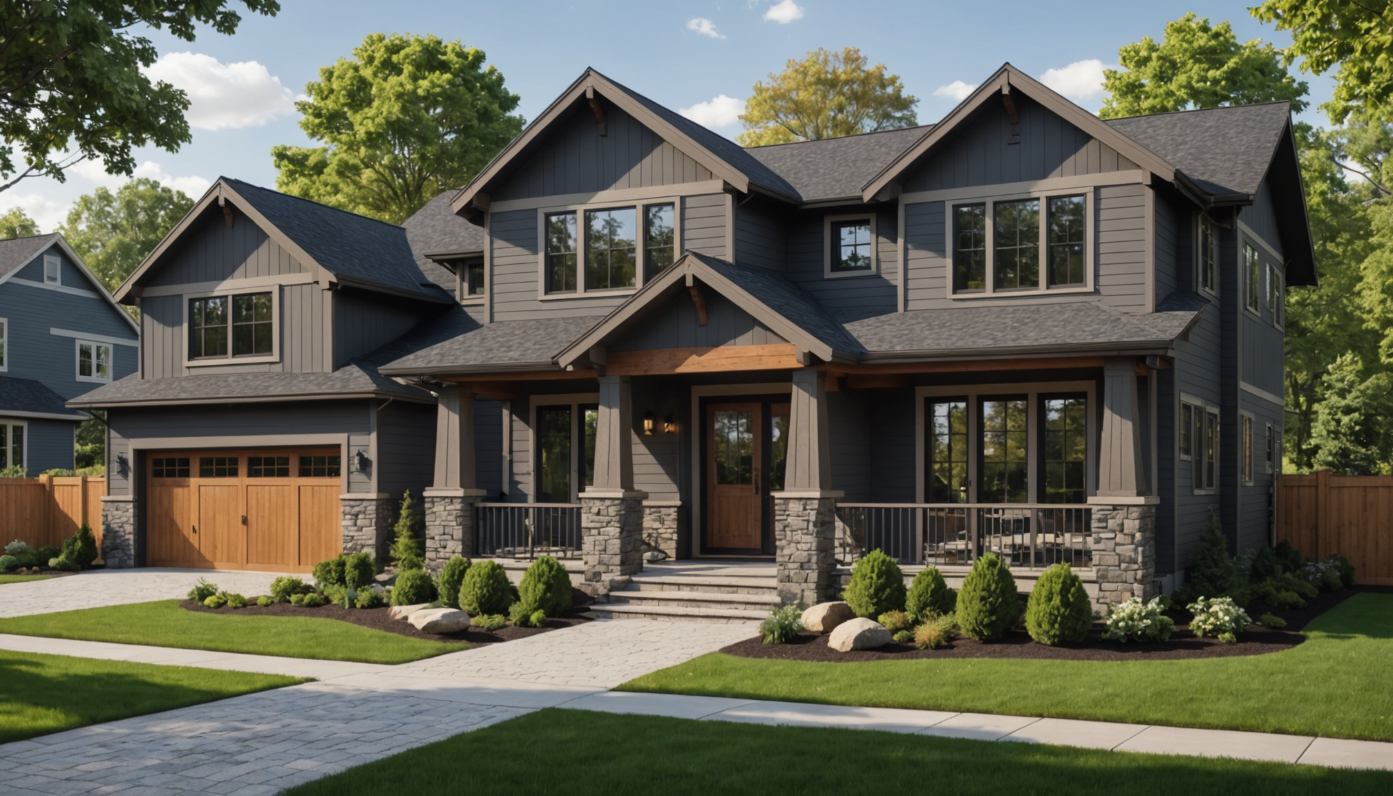
One of the most popular color choices is gray. Its versatility makes it suitable for a variety of architectural styles from modern to traditional. Shades of gray, from light silver to deep charcoal, offer a sophisticated backdrop that complements other accent colors and materials such as wood or stone. Furthermore, gray’s neutral nature allows it to blend seamlessly into both urban and rural environments.
White, often associated with purity and simplicity, continues to be a timeless favorite. It provides a crisp, clean appearance and helps to accentuate other architectural elements of the home. Furthermore, a white exterior pairs beautifully with dark window trim and doors, creating a striking contrast that enhances the home’s visual impact.
In contrast, blue siding offers a refreshing alternative that can range from soft, pastel shades to deep, navy hues. This color brings an element of tranquility and serenity to a home’s exterior. Blue works particularly well in coastal settings, but can be adapted to almost any style, providing a charming and distinctive appearance.
For homeowners seeking a warmer color palette, earthy tones like taupe, beige, and olive are gaining popularity. These colors naturally complement the surrounding landscape and evoke a sense of warmth and comfort. They are appealing for traditional-style homes as well as contemporary builds that aim to integrate more seamlessly with natural surroundings.
Lastly, there is an increasing appreciation for bold and dramatic hues. Colors such as deep red, forest green, and even black have started to emerge as statement choices, turning homes into standout architectural pieces. These colors demand attention and can significantly elevate the aesthetic of a property when executed with careful consideration of the overall color scheme.
The following table compares some of the currently popular siding colors:
| Color | Style Compatibility | Key Characteristics |
| Gray | Modern, Traditional, Rustic | Sophisticated, Versatile, Neutral |
| White | Classic, Contemporary | Crisp, Clean, Timeless |
| Blue | Coastal, Traditional | Refreshing, Tranquil, Distinctive |
| Earthy Tones | Rustic, Traditional, Modern | Warm, Natural, Comfortable |
| Bold/Dark Hues | Modern, Statement | Eye-catching, Dramatic, Unique |
As homeowners consider these popular siding color options, it’s essential to balance personal preference with practical considerations such as neighborhood aesthetics, climate conditions, and potential resale value. Choosing a siding color is a significant decision that contributes to a home’s overall charm and elegance, and staying informed about the latest trends can help make this choice a rewarding one.
color combinations for modern homes
 In modern home designs, the choice of siding color combinations plays a crucial role in defining the architectural style and enhancing the overall aesthetic. To create a dynamic and contemporary look, consider combining different shades and hues that reflect both current trends and timeless elegance. Here’s how you can approach choosing effective color combinations for modern homes:
1. Identify the Architectural Style:
– Begin by analyzing the lines and form of your home. Modern architecture often emphasizes clean lines, minimalist forms, and a blend of natural and industrial materials. Knowing your home’s design can guide the choice of colors that contribute to a coherent look.
2. Select a Base Color:
– Choose a neutral base color for the siding, such as soft gray, taupe, or off-white. These shades are versatile and provide a backdrop that works well with both muted and bold accent colors.
– Ensure the base color complements permanent fixtures like roofing or stonework to avoid clashing.
3. Choose an Accent Color:
– Accent colors should highlight architectural features such as window frames, doors, or eaves. Popular choices include black, charcoal, or dark navy, as these provide striking contrast to the base color.
– Deciding on a darker accent can offer a dramatic effect, accentuating modern design elements effectively.
4. Consider a Pop of Color:
– Introduce a pop of color through elements like the front door or outdoor furnishings. This could be a bright shade such as red, orange, or teal, providing visual interest and a welcoming note.
– To maintain harmony, ensure this vibrant addition is used sparingly and is restricted to small areas or features.
5. Integrate Natural Elements:
– Consider complementing your color palette with natural materials like wood or stone accents. These elements offer textural interest and can harmonize well with both neutral and bold colors.
– Think about using wood siding or stone trim to create a balance between synthetic and natural aesthetics for a modern look.
6. Review Against the Environment:
– Evaluate how your selected combination interacts with the surrounding environment. For urban settings, sleek and dramatic schemes might fit better, while in rural or suburban localities, softer contrasts and more harmonious colors can look more appropriate.
– Observe how lighting throughout the day affects the perception of colors. Natural light can transform colors, and testing swatches at different times can prevent future regret.
7. Take Inspiration from Modern Trends:
– Incorporate trending colors subtly to maintain a modern feel while ensuring longevity in your design. Trends may include muted pastels, metallic finishes, or shades inspired by technology, such as steel blue or cyber green.
– Keep the trends in small doses, such as window trims or fixtures, ensuring the overall design remains cohesive and timeless.
Implementing thoughtful color combinations can significantly escalate the curb appeal of a modern home while reflecting both creativity and sophistication. Whether opting for sleek monochromes or combining bold contrasts with classic neutrals, the key lies in maintaining balance and cohesion throughout the design.
timeless classic colors
When considering options that never go out of style, there are certain colors that have stood the test of time when it comes to enhancing a home’s appearance. These colors not only offer a strong aesthetic appeal but also adapt well to various architectural styles, ensuring that a home remains attractive and relevant through changing trends.
One of the most enduring choices is beige. It offers a warm and inviting vibe while maintaining a sense of sophistication. Beige can vary from light, sandy tones to richer mocha hues, effortlessly complementing traditional, colonial, and Mediterranean-style homes. Its neutrality allows homeowners to play with a range of accent colors that can be used for trim, doors, or shutters. This flexibility makes beige a versatile classic.
Deep green is another color with timeless allure, embodying a sense of grounding and connection to nature. Shades such as forest green and sage provide a rich, mature backdrop, creating a serene and stately presence for any home. This color works exceptionally well in lush, wooded areas or landscapes with significant greenery, enhancing both the house and its surroundings.
Another perennial favorite is navy blue. This shade brings a touch of elegance and is often associated with a nautical or coastal aesthetic. Its depth can be accentuated with white or cream trims, creating a stunning contrast that has an enduring appeal. Navy blue can modernize a colonial or Georgian-style home while integrating seamlessly within urban, suburban, or seaside neighborhoods.
Brick red has long been admired for its warmth and robust appearance. It simulates the rich color of natural clay, which has been historically used in construction, giving homes a grounded and earthy appeal. This color pairs beautifully with muted grays and whites, offering a timeless quality that enhances both older, historic homes and more contemporary builds looking to evoke a classic charm.
Lastly, taupe—a perfect blend of brown and gray—provides a subdued elegance. Its understated nature makes it a suitable choice for a wide range of styles, from rustic farmhouses to sleek modern abodes. Taupe harmonizes with nature, making it an ideal selection for homes surrounded by natural landscapes or those looking to maintain a neutral, harmonious appearance against a city skyline.
These classic colors not only hold aesthetic value but also improve a home’s marketability by appealing to a broad audience. Their enduring nature means that homeowners can enjoy them for years while maintaining strong curb appeal and ensuring their investment stands the test of time.
seasonal color influences
When selecting siding colors with a nod to the changing seasons, it’s crucial to remember how different times of the year can influence perception and mood. Seasonal color influences are not just about matching the foliage or the winter wonderland but also about eliciting the emotions each season brings, creating a home that resonates with its surroundings all year round.
In the spring, nature comes back to life with a fresh burst of color. Here, siding colors that echo this renewal and energy—such as pastel greens, soft blues, and light creams—can be particularly appealing. These hues reflect the delicate freshness of budding flowers and new leaves, offering a lively and inviting aura. This approach is especially beneficial in areas where lush gardens or tree-lined streets serve as the backdrop for residential properties.
Summer brings with it a vibrance and warmth that is hard to resist. Homes with siding in cheerful yellows, sandy beiges, or coral hues can complement the radiant intensity of summer days. These tones work wonderfully in sun-drenched areas, providing a bright and joyful façade. For those near coastal regions, incorporating soft aquatic shades like turquoise or seafoam can mimic the ocean’s shimmer, blending seamlessly with the summer landscape.
As the leaves turn and fall ushers in a cozy transformation, consider deeper, richer tones that encapsulate the heart-warming essence of the season. Rusty reds, burnt oranges, and deep browns can mirror the hues of autumn foliage, creating a harmonious balance with the seasonal scenery. These shades not only provide warmth but also sophistication, making a home appear more inviting as the days get shorter and the air crisper.
Winter often paints the world with a stark, serene beauty. Amidst snowy or barren landscapes, opting for bold contrasts like dark charcoal, crisp white, or navy can make your home stand out while embracing the winter aesthetic. Dark siding colors against a snowy backdrop can emphasize purity and tranquility, while a rich red or green can add a festive touch during the holiday season, enhancing curb appeal and establishing a welcoming environment.
In selecting siding colors, it’s crucial to consider the interplay between the color palette and the natural shifts in light and temperature throughout the year. Each season offers a unique palette from which to draw inspiration, ensuring your home remains in tune with its environment. Balancing personal taste with these seasonal influences can help in choosing siding colors that not only enhance curb appeal but also capture the essence of each season, making your home a beautiful reflection of the changing world around it.
factors to consider when choosing siding colors
When choosing siding colors, it’s essential to consider several factors that contribute not only to the aesthetics but also to the functionality and longevity of your home’s exterior. One crucial factor is the architectural style of your home. Traditional styles such as Colonial or Victorian might pair better with classic colors like white, beige, or muted pastels, while more contemporary designs can handle bolder, minimalist palettes.
The surrounding environment plays a significant role in color selection. Consider the natural landscape, neighboring homes, and the overall setting. For example, homes in wooded areas might benefit from earthy tones that blend seamlessly with their surroundings, while suburban homes might opt for more subdued colors that complement the personal style of the neighborhood.
Climate and weather conditions also influence color choice. Lighter shades can reflect the sun’s rays, helping to keep homes cooler in sunny climates, whereas darker colors may absorb heat, making them more suitable for cooler regions. Additionally, consider the durability of the color and material against local weather elements, such as moisture, sun exposure, and temperature fluctuations.
It’s important to factor in personal style and preference. The color of your siding should reflect your taste and the atmosphere you wish to create. Whether you prefer a tranquil retreat or a vibrantly welcoming façade, your home should express individuality while maintaining harmony with its structural design.
Lastly, resale value should not be overlooked. Popular and universally appealing colors tend to enhance the marketability of a home. While unique and trendy choices showcase personal flair, neutral tones are more likely to appeal to a broader audience, potentially increasing your home’s value and attractiveness to potential buyers.
In conclusion, the right siding color choice can beautifully enhance your home’s curb appeal, making a positive impression while complementing architectural designs, personal tastes, and environmental factors. As you explore your options, balancing trending choices with timeless colors can lead to a selection that will not only keep your home stylish but also contribute to its long-lasting aesthetic appeal and value.